
Power Apps Portal maker can add a set of predefined components on the page to format the layout and add static and dynamic content.
The WYSIWYG (What You See Is What You Get) editor allows you to add and edit the required components on the canvas easily, from Toolbelt components.

The selected component is added to the canvas inside the editable element on the selected webpage.
To delete a component, select the component on the canvas and then select Delete on the command bar at the top of the page.
| Components | Description |
|---|---|
| Section Layout | These components will allow the maker to place a one, two, or three-column section on a page. Additional components can be embedded within the sections. |
| Text | Places a static text box on the webpage. |
| Image | Places an image control on the page. A maker can choose an existing image or upload a new image. The image file will be stored as an attachment of the web file record in the portal metadata. Note: Allowed extensions are : .jpg, .jpeg, .bmp, .gif, .png |
| IFrame | The IFrame will embed a particular URL from another website or application. |
| Form | The form will display a form based on a model-driven form that is from a specific Microsoft Dataverse record. |
| List | The list component will display a view based on a model-driven view from specific Dataverse records. |
| Breadcrumb | The breadcrumb will display a navigational path based on the webpage hierarchy in the portal. |
| Power BI | The Power BI component will allow you to add Power BI dashboards and reports for your customers or your internal employees, or you can add a Public-Facing Power BI web report. |
| ChatBot | To embed a Microsoft Power Virtual Agents bot onto the portal page. |
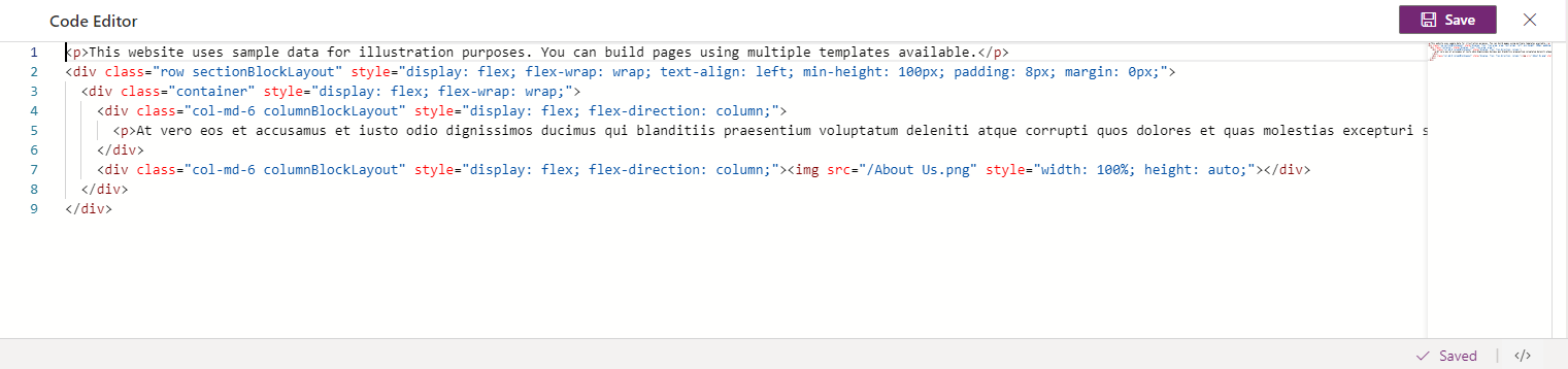
Note : Other components such as headings, buttons, web forms, hyperlinks, and so on, can be added to a page directly by using the code editor.

Hope you learn something, Thanks for Reading 📖!
Happy Power365ing!
