
Web page Sections Layouts allows to define a structure for web page and arrange portal components.
The page designer enables us to define section layouts that consist of one, two, or three columns. There may be a requirement to build a layout that consists of more than three equally spaced sections. you can add portal components inside the sections as per the requirement.In this post, we’ll walk through one way to accomplish.
- Go to Power Apps Maker Portal.
- Clink on Apps on the left Pane, and select the Power Apps Portal and Click on edit.

3. Portal will open edit mode in Portal studio.
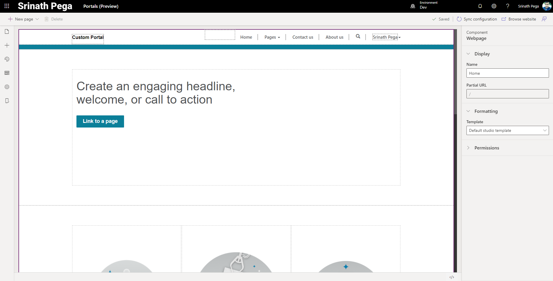
4. Click on Page and navigation on left Toolbelt.

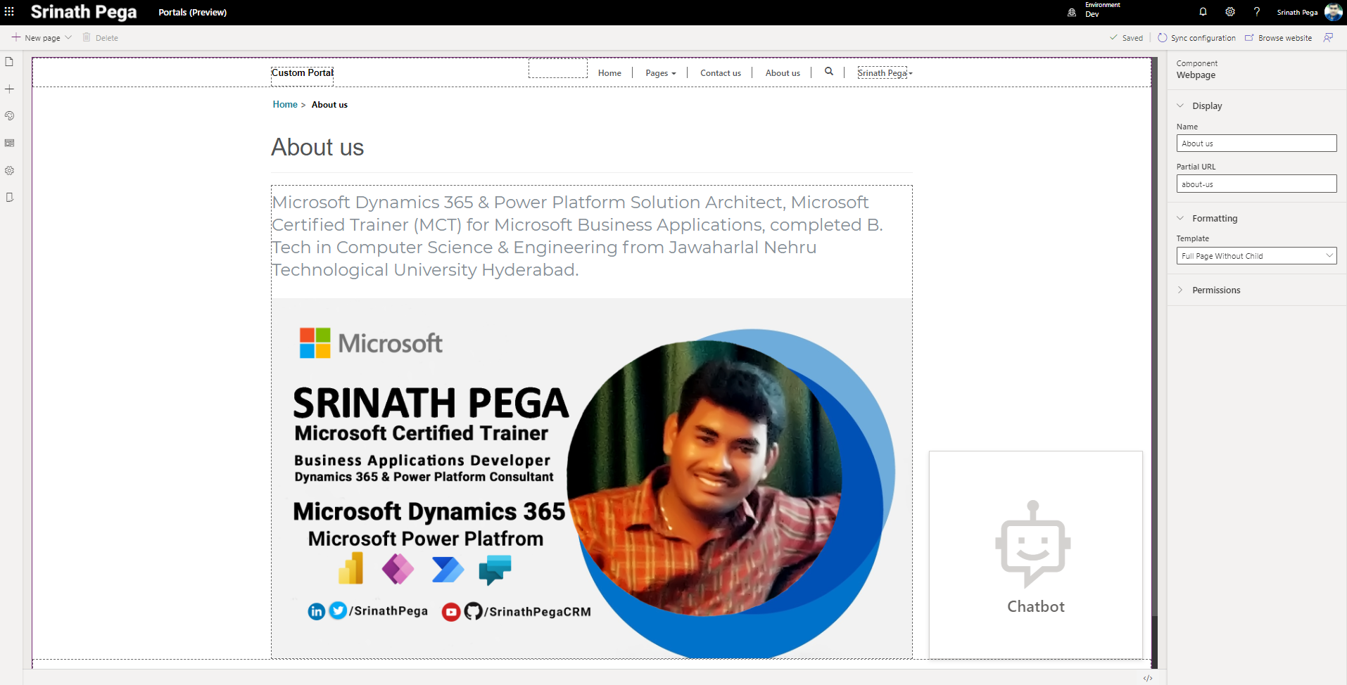
5. It will shows the list of web pages in the Portal site. Click an the Web Page which want to customize.
6. Now to add section layouts to web page click on Compnents on left pane Tooolbelt in Portal studio.
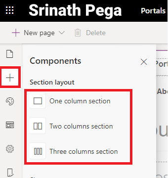
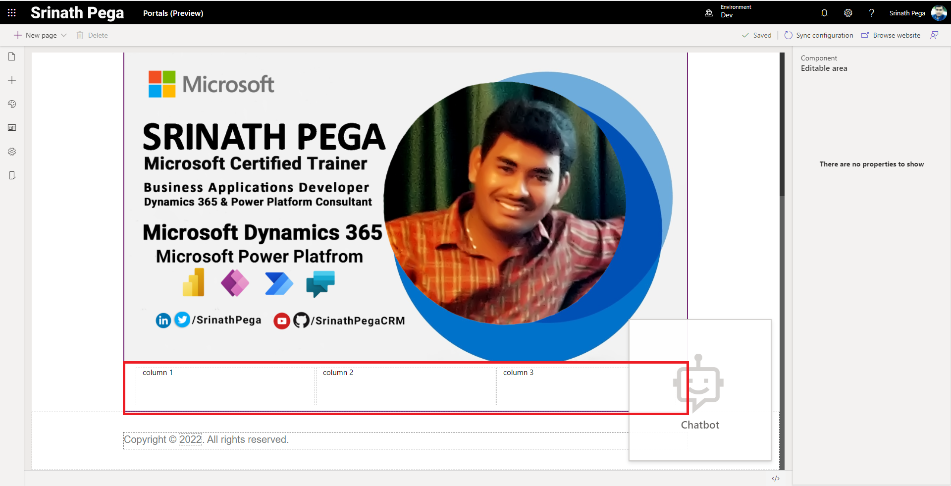
7. Click on any one of the section layout, It will add to the web page. lets add Three columns section.
8. If we wants to add 4 Columns in single row, for that we don’t have section layout. But we can edit in code to make it as a 4 column section layout. For that Click on source code editer bottom.
<div class="row sectionBlockLayout" style="text-align: left; min-height: 100px; padding: 8px; margin: 0px;">
  <div class="container" style="display: flex; flex-wrap: wrap;">
    <div class="col-md-4 columnBlockLayout"> column 1</div>
    <div class="col-md-4 columnBlockLayout">column 2</div>
    <div class="col-md-4 columnBlockLayout">column 3</div>
  </div>
</div>
9 . To make the section as 4 colunm, add the code <div class=”col-md-4 columnBlockLayout”>column 4</div> to the surce code.
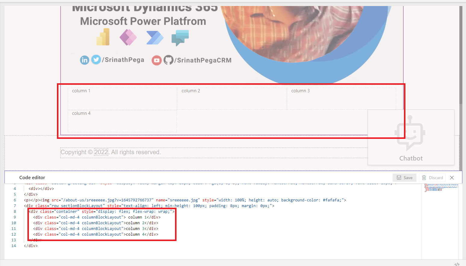
The column 4 added to the section. But its showing in the different row rather than in the same row.
Power Apps Portal uses the Bootstrap framework (v3.3.6). This enables us to build responsive pages by dividing a page into 12 sections.
It’s easy to build a page with one, two, three, or six equally spaced columns. This is because we can wholly divide 12 by any of these numbers.
Defining 4 Column Section Layout:
<div class="row sectionBlockLayout" style="text-align: left; min-height: 100px; padding: 8px; margin: 0px;">
  <div class="container" style="display: flex; flex-wrap: wrap;">
    <div class="col-md-3 columnBlockLayout"> column 1</div>
    <div class="col-md-3 columnBlockLayout">column 2</div>
    <div class="col-md-3 columnBlockLayout">column 3</div>
    <div class="col-md-3 columnBlockLayout">column 4</div>
  </div>
</div>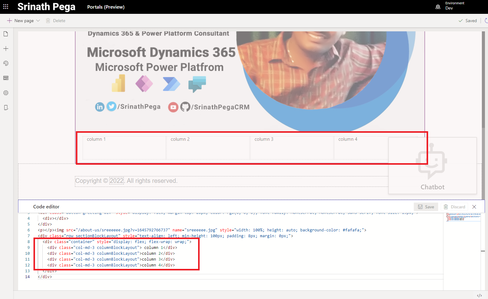
10. Now we can see the column -4 in the same row of section.
Hope you learn something, Thanks for Reading 📖!
Happy Power365ing!
